Pure flower. Pure identity.
A brand you can spot from 8 miles high.
Client
Sky High Gardens
Sector
Cannabis
Years
2014 - 2018
My Role
Creative direction, brand strategy, identity, packaging, campaign, retail, web, press.
Wins
Launch month revenue at $55,464. One month later at $159,583. Year one revenue at $1,192,836. Year two revenue at $2,768,294.
The Reality
A tier 3 cannabis producer in Seattle was about to hit the market with a massive new harvest. The product was strong, but weak shelf presence was driving revenue down. They needed a premium brand that worked end to end from packaging to in-store to press. Here’s how we turned it into a brand people continue to reach for.
The Insight
You only have two seconds. Use them. People buy with their eyes first. If the brand makes them feel smart and cool they reach for it. If a budtender can sell it in one line it moves. So the plan was simple. Clarity at a glance, character up close, a story you can pass on.
The Plan
Define a premium identity rooted in craft and culture.
Design packaging that commands attention on crowded shelves.
Give every strain a face, a voice and a collectible story.
Build a system of assets that feel alive across print, digital and retail.
Produce imagery that captures the brand’s energy and elevation.
Develop a launch strategy that turns drops into events.
Integrate social, influencer and press channels to drive anticipation.
Sustain visibility through ongoing content and community engagement.
Position Sky High Gardens as the benchmark for modern cannabis branding.

How it took shape.
Defining the Visual Language
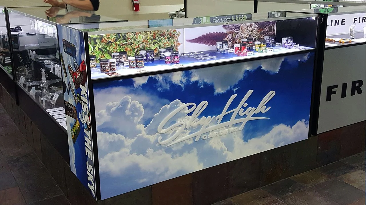
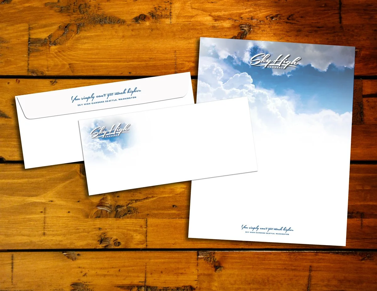
We refined the logo for clarity and presence. Then we built a sky blue system with bold cumulus clouds. Blue that feels endless. Clouds with real shape. It pops under glass, holds color in print and stays legible at small sizes. The look delivers a quick hit of freshness that budtenders love and shoppers notice. On the shelf it’s distinct and unmistakable. It works in any shop and leaves room for growth. It sets a foundation that feels like home anywhere.
Old Logo
New Logo

From idea to system.
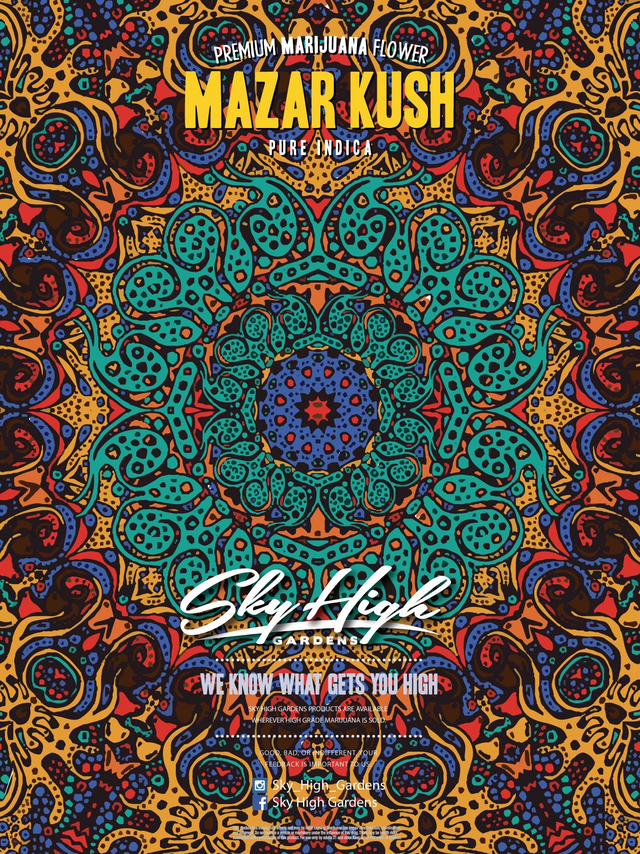
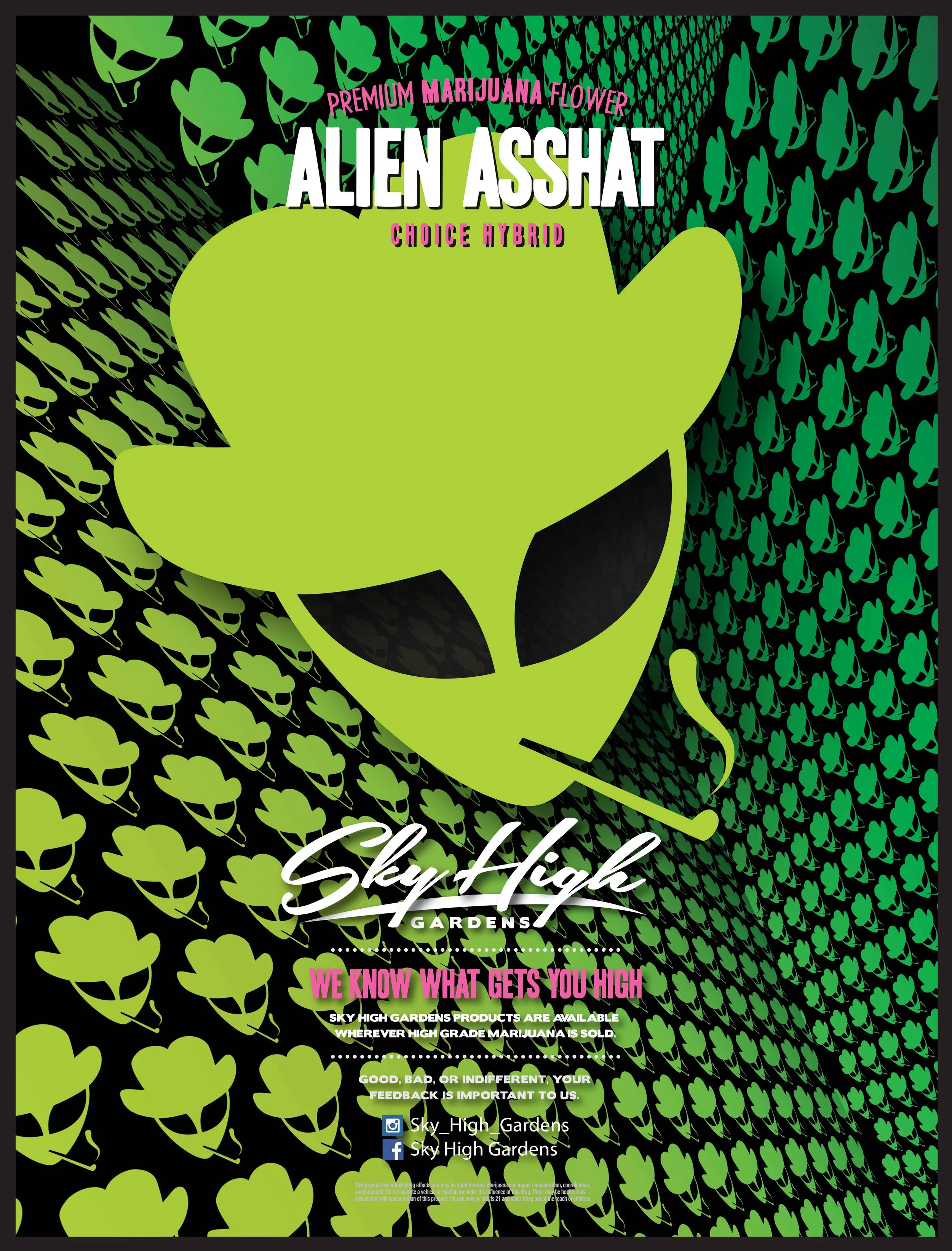
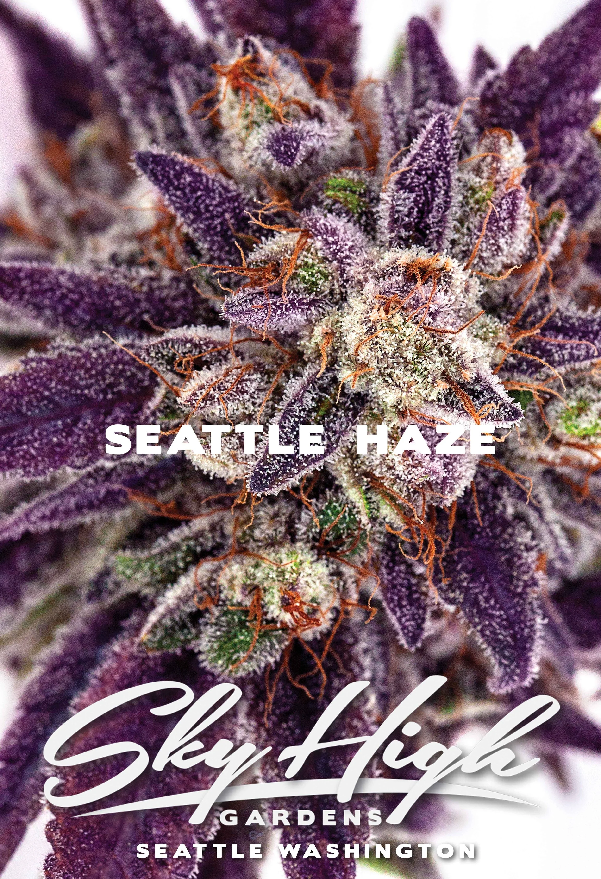
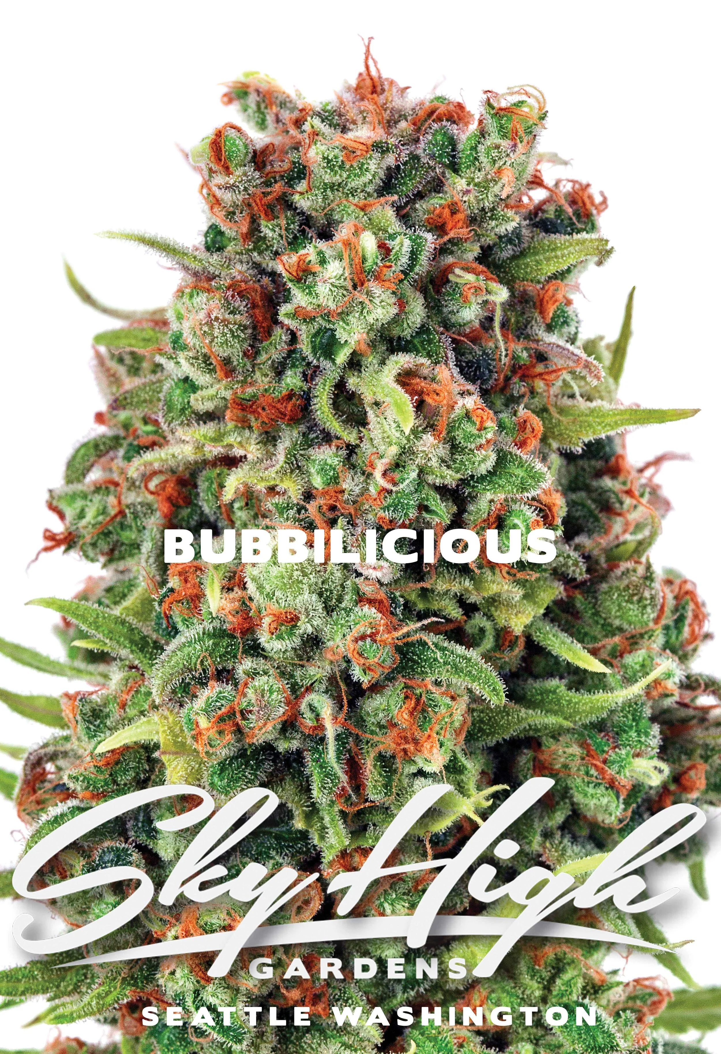
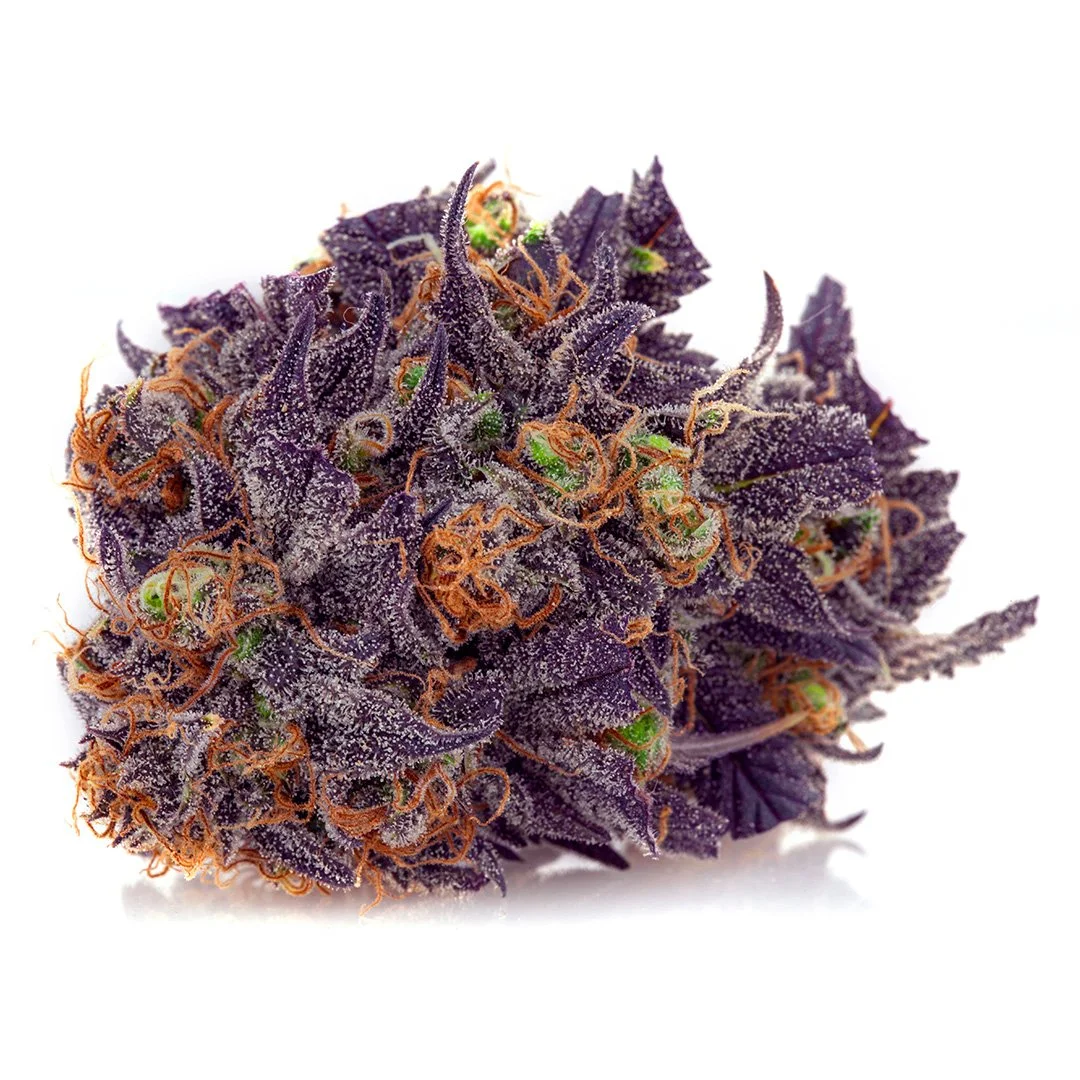
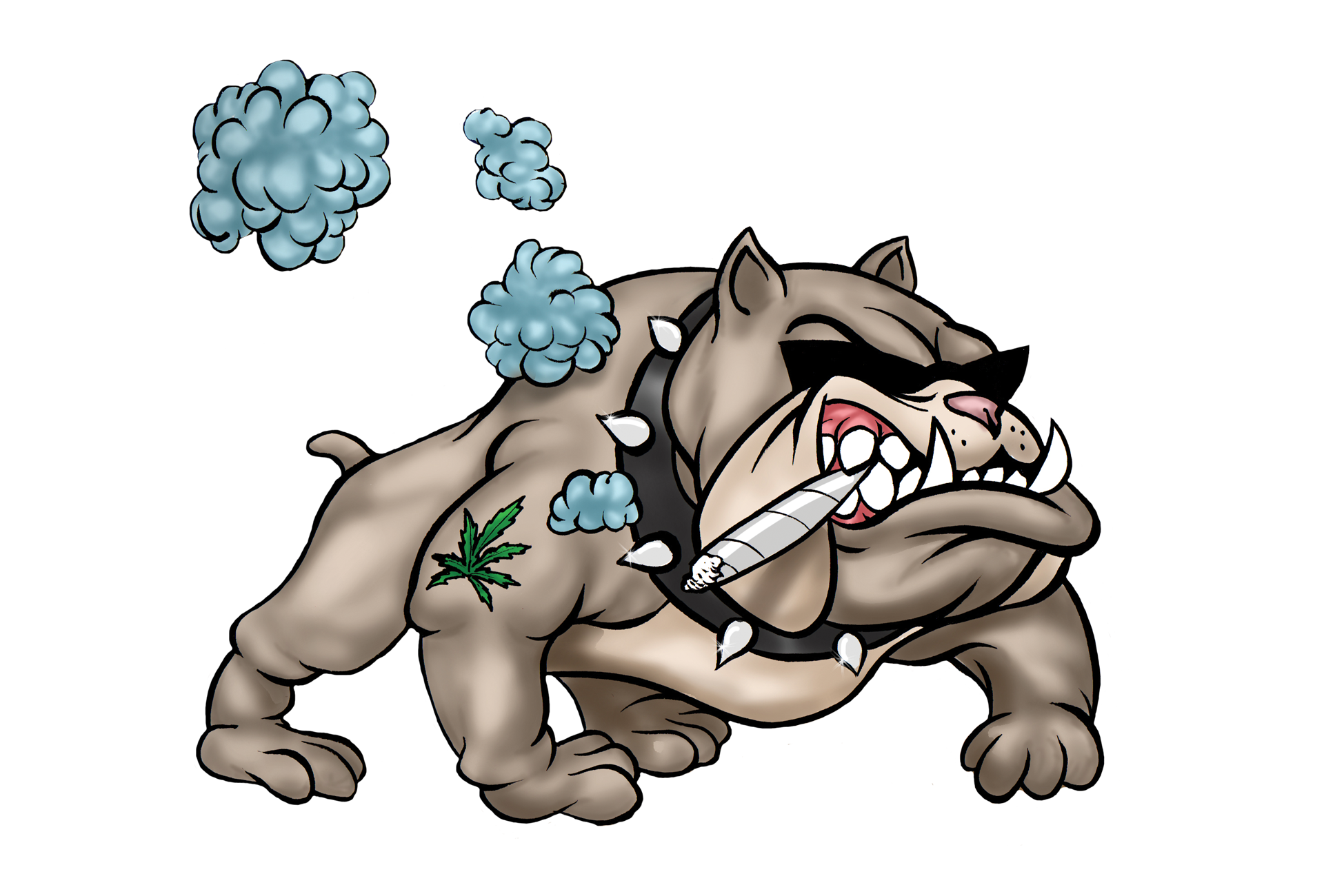
A World You Can Hold
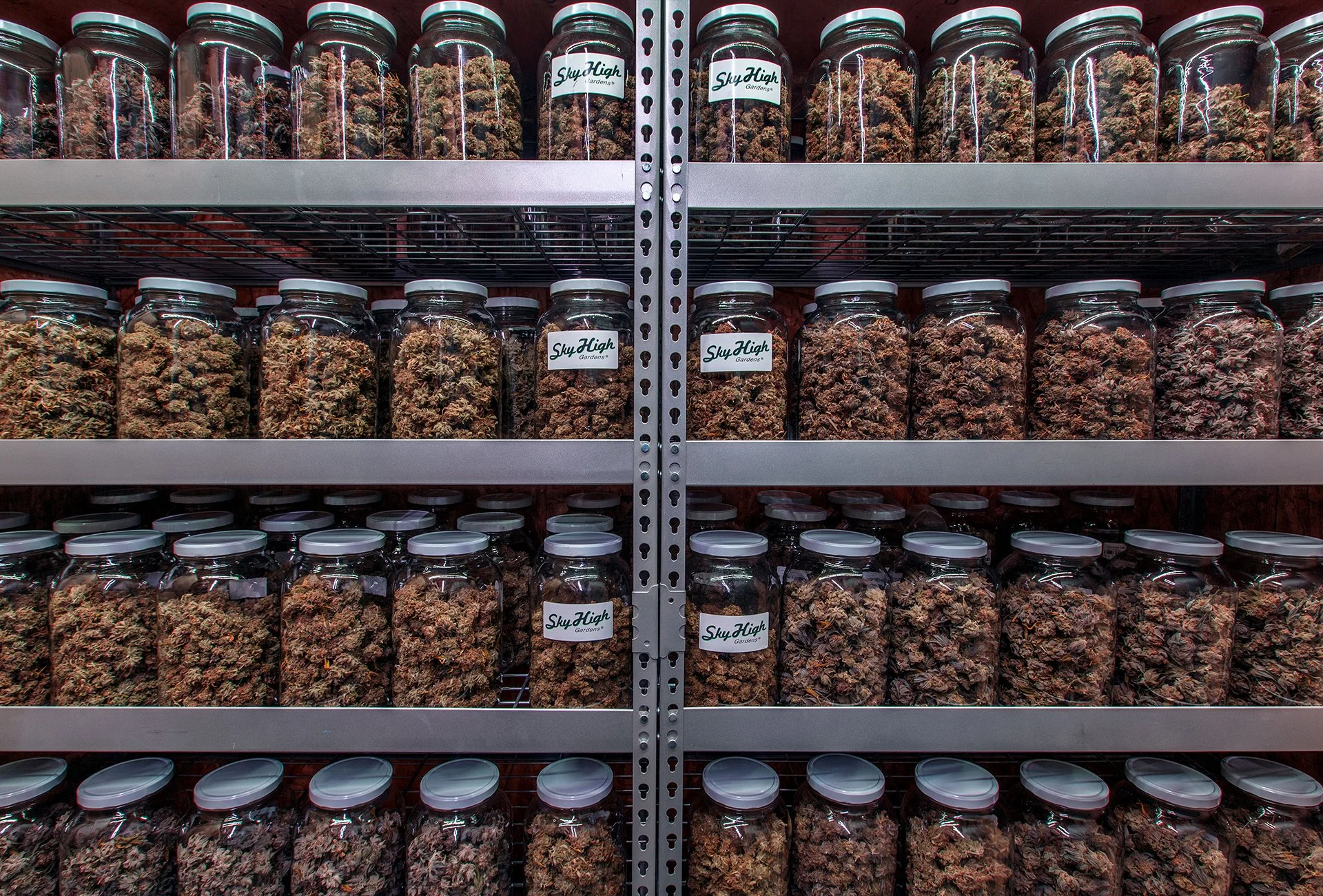
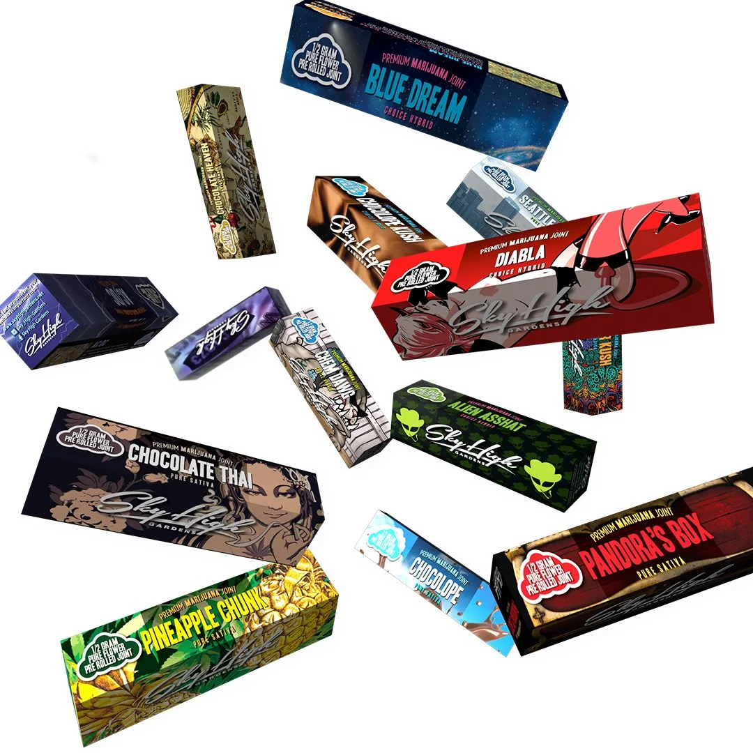
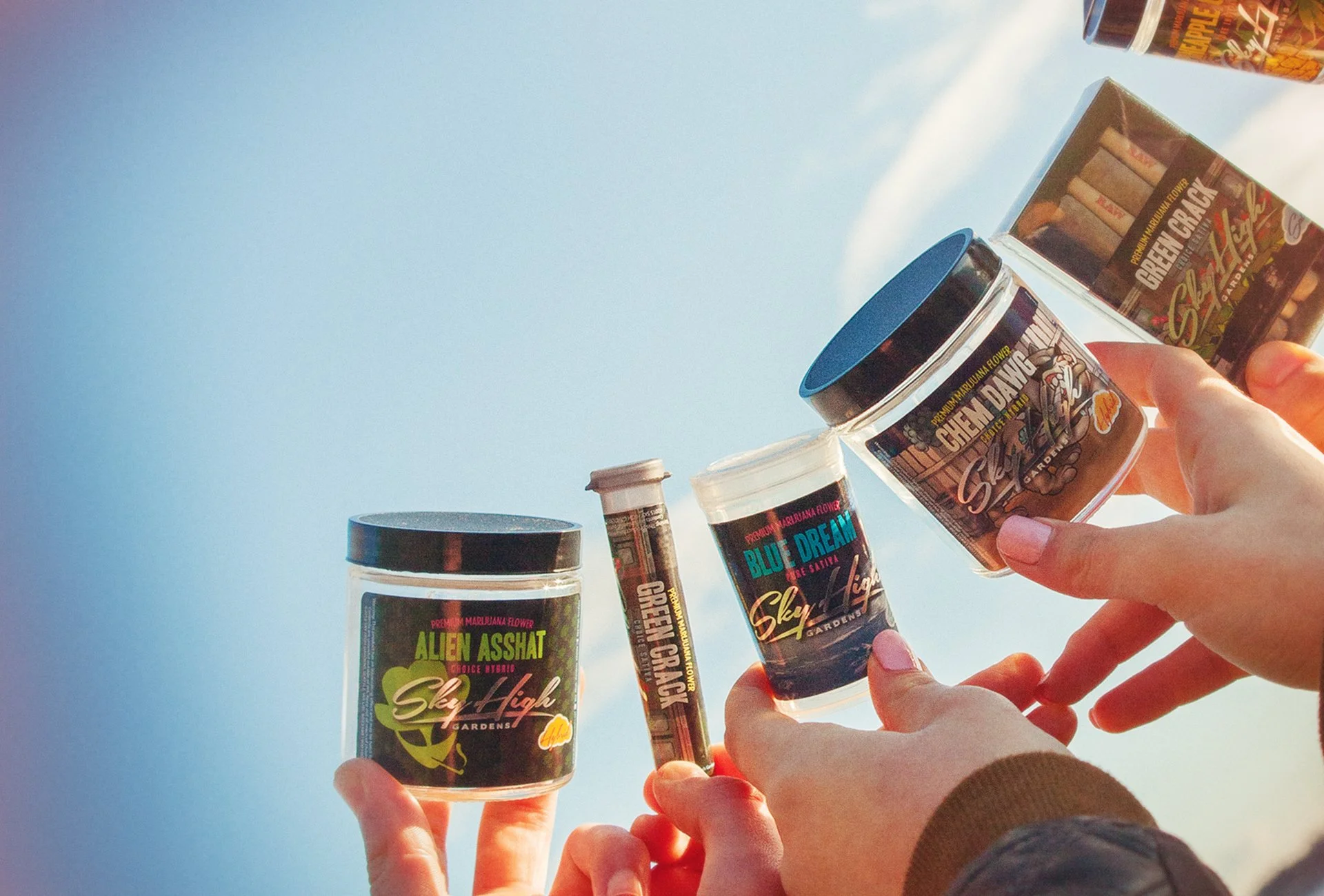
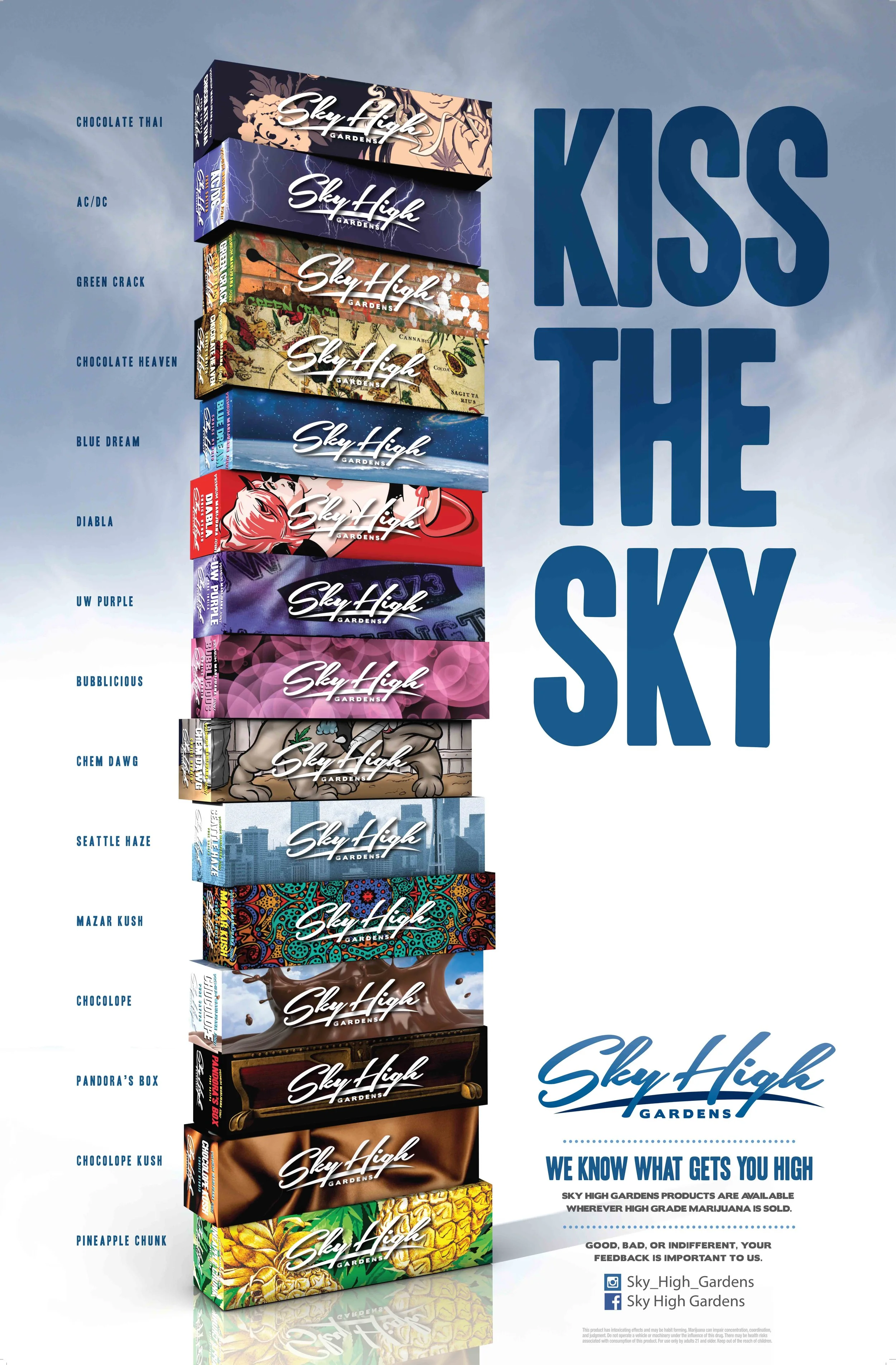
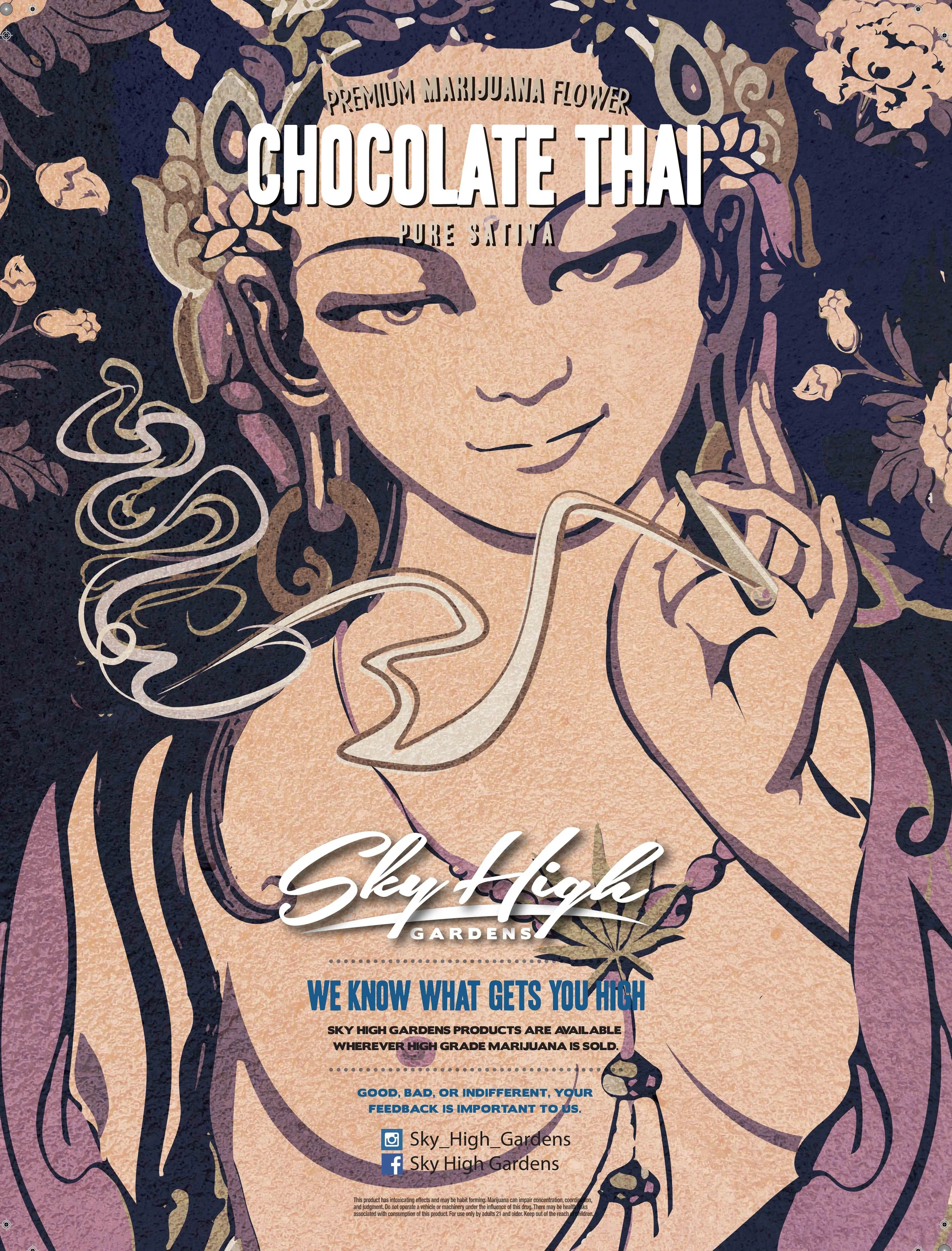
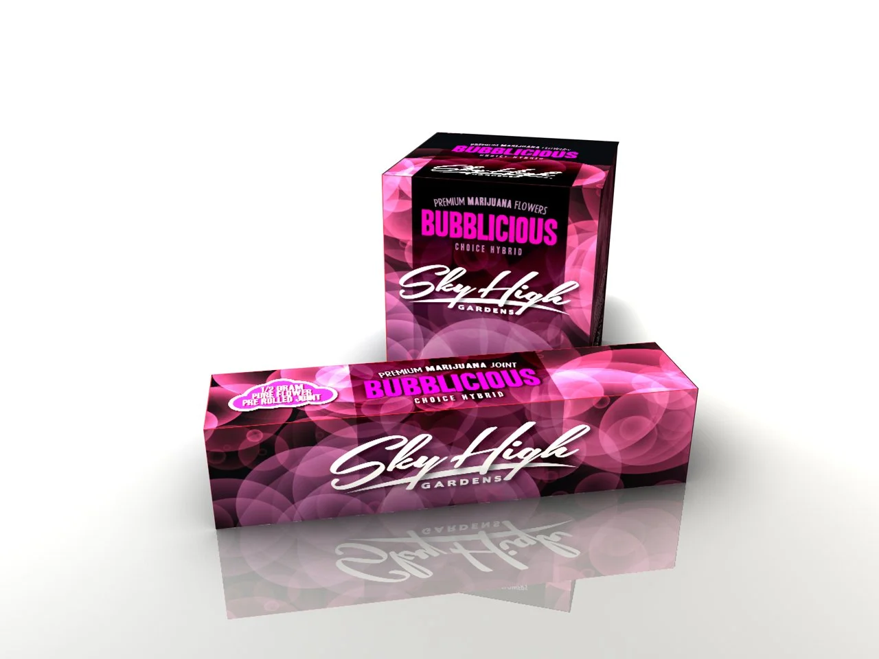
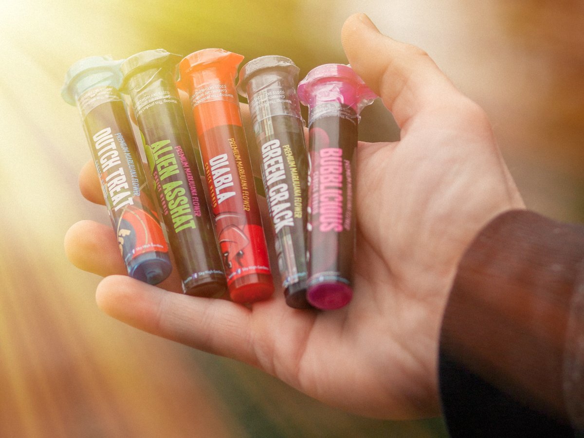
We built a full visual system around each cannabis strain. Every one got its own illustrated character and color story. Not a flavor. A face. Art that lives on jars, trays, posters and hoodies. The goal was simple. Land the look at first glance and make the choice feel personal. We set strong color rules and clear strain cues. Every label read clean under harsh retail light and held up in print and in hand.
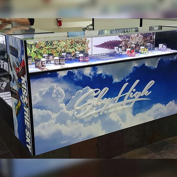
We printed large strain posters, built a shirts and hats capsule and sent stores display kits. We designed counter displays, shelf talkers, menu boards and window banners that carried the sky system into the shop so shoppers could walk up and feel the fresh air. Budtenders had what they needed to sell fast and we had them tuck trading cards into purchases so customers could collect the designs of their favorite strains.
-
![]()
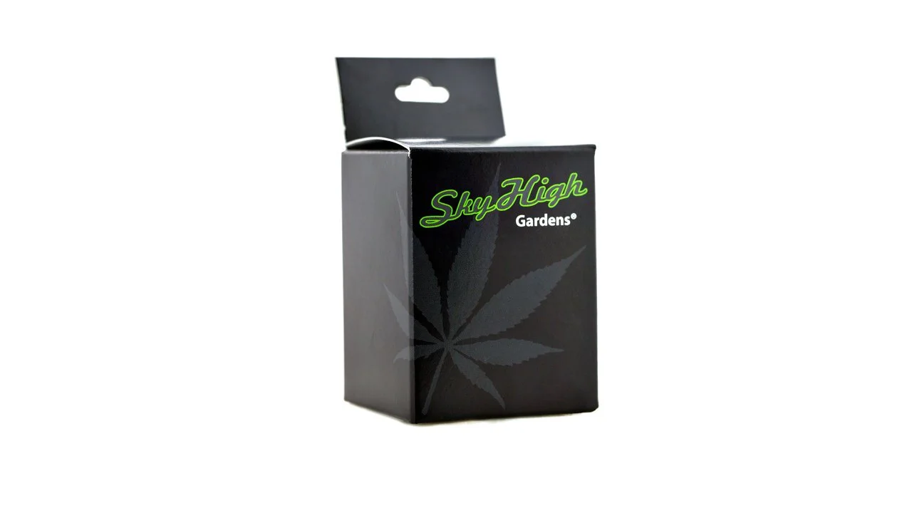
Original Packaging
-
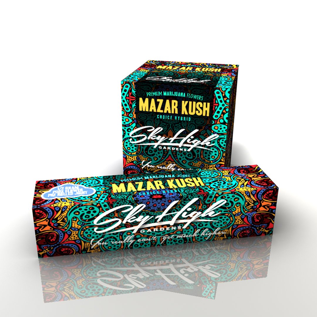
![]()
New Packaging
-
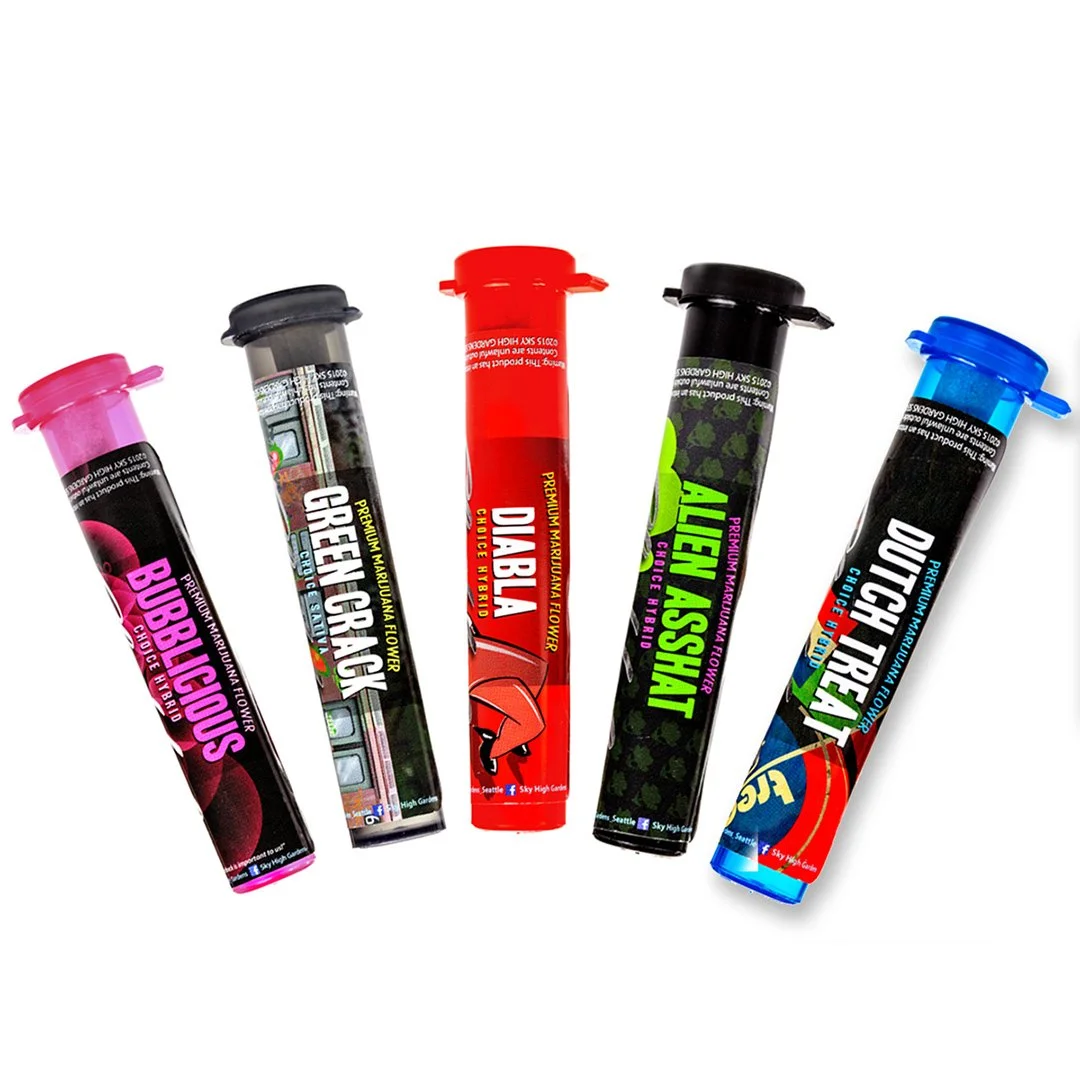
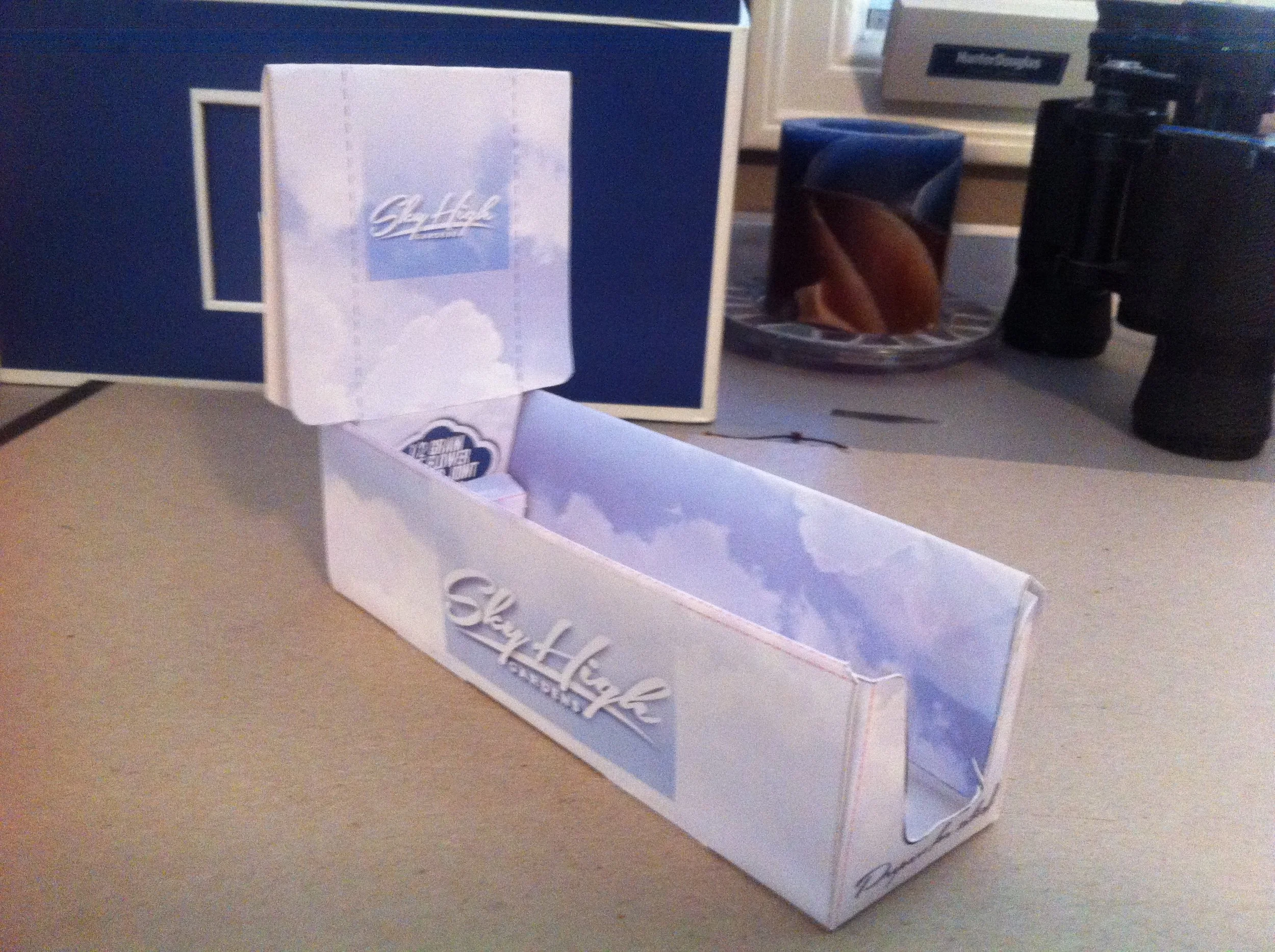
![]()
New Tubes
-
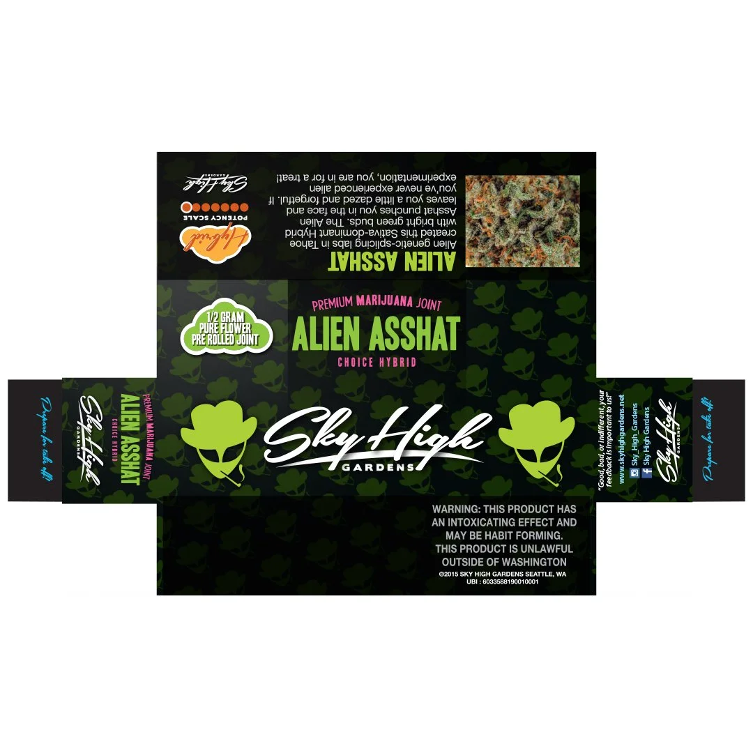
![]()
Joint Packaging Layout
-
![]()
Joint Boxes
-
![]()
Display Counter
-
![]()
Product Beauty Photo
-
![]()
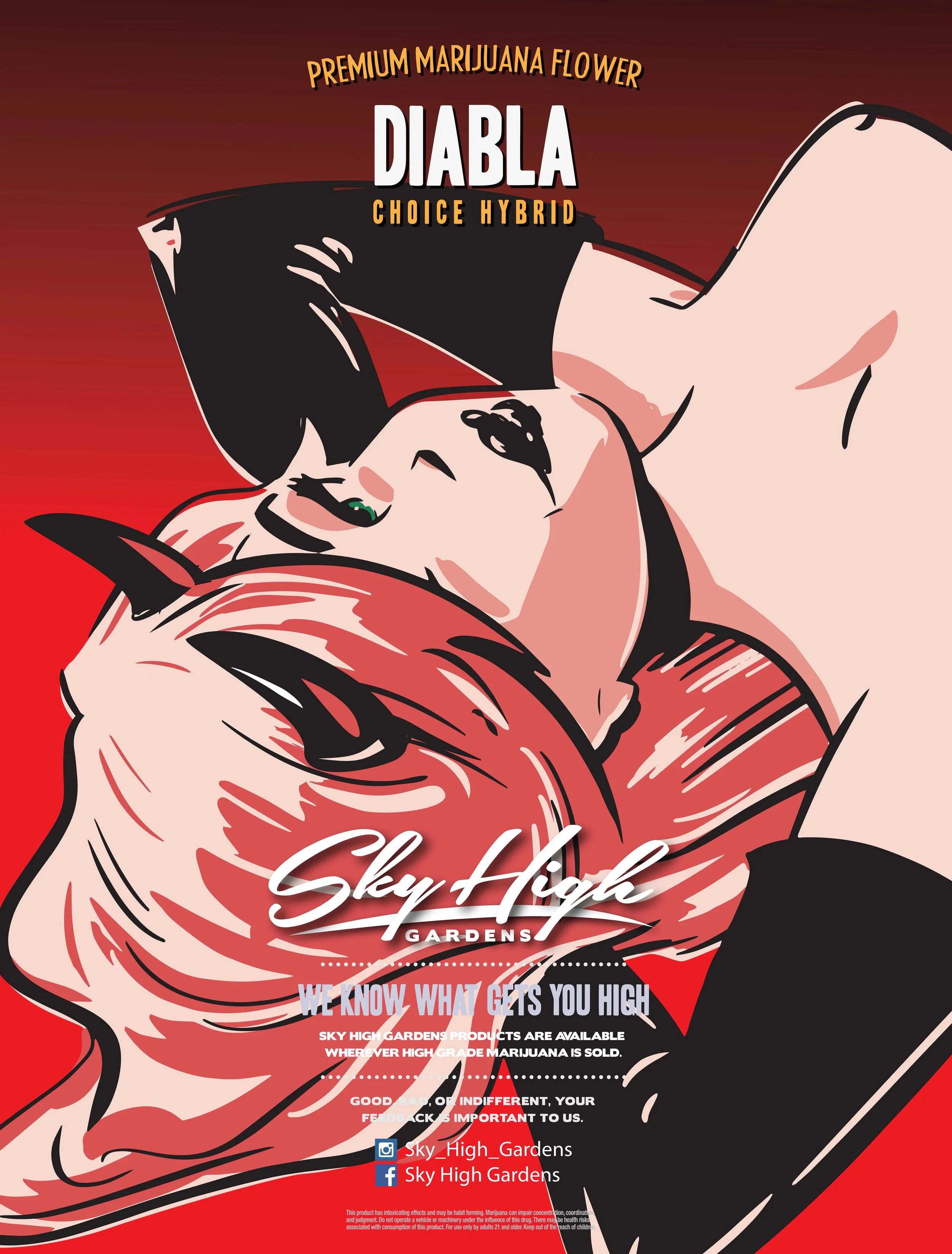
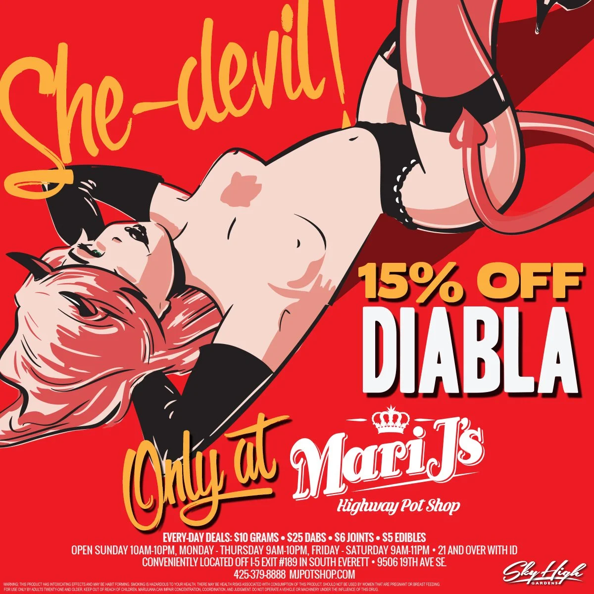
Diabla Poster
-
![]()
Bubblicious Poster
The roll out.
In the Wild
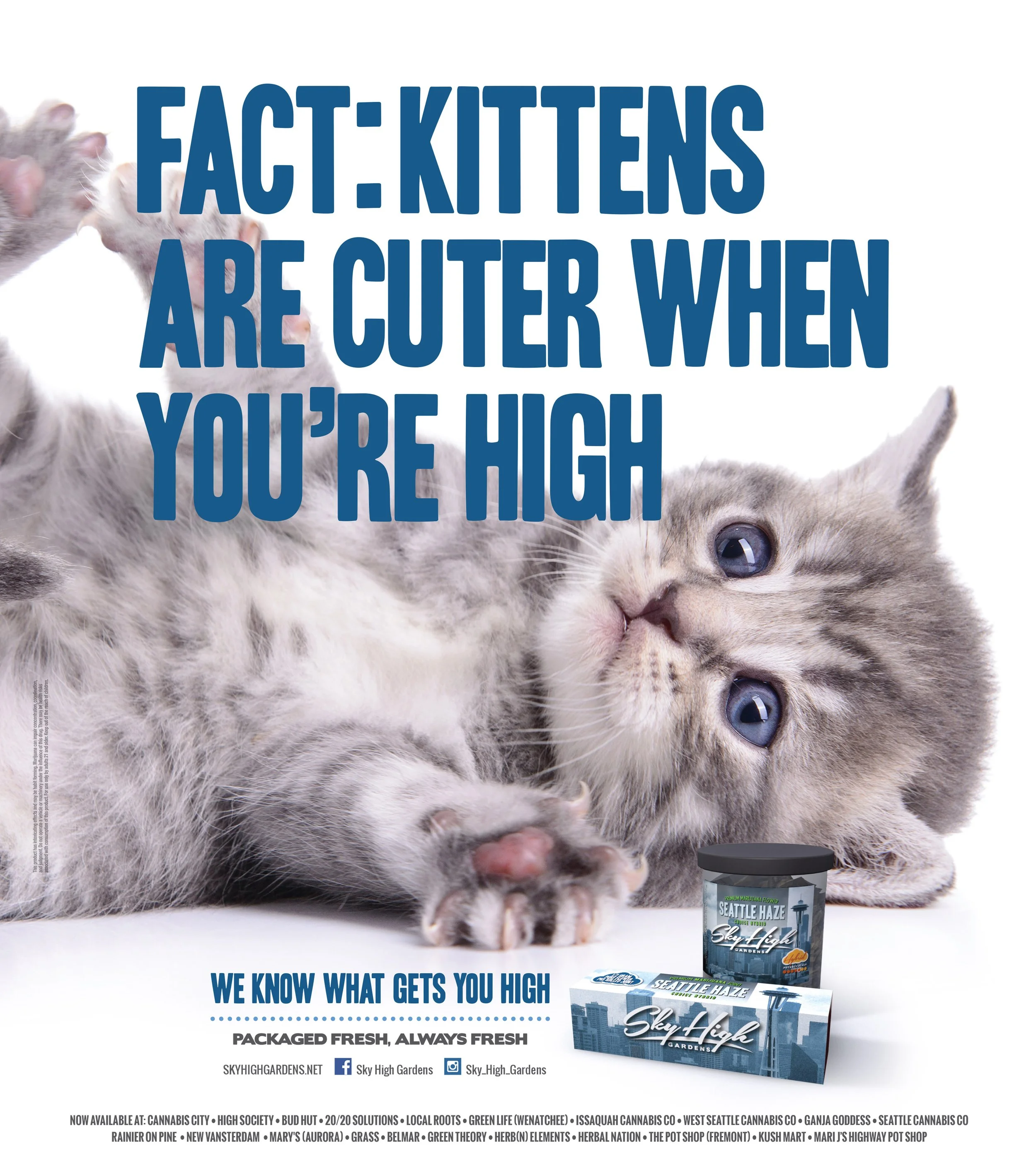
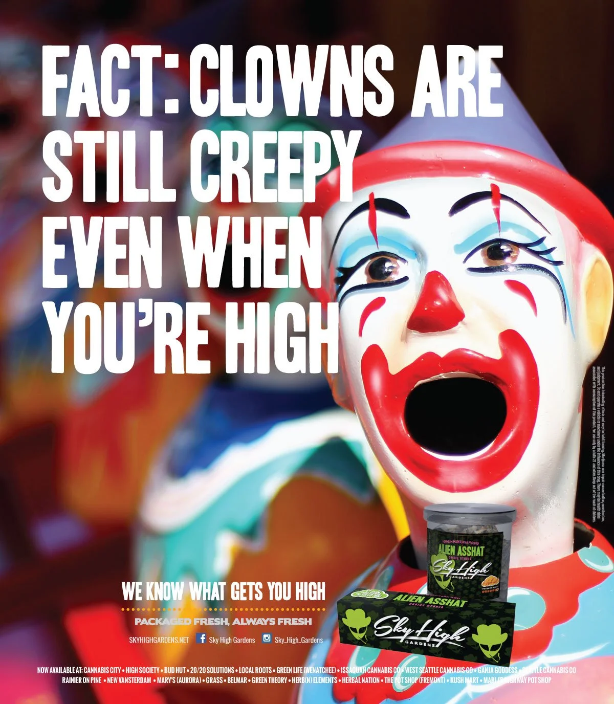
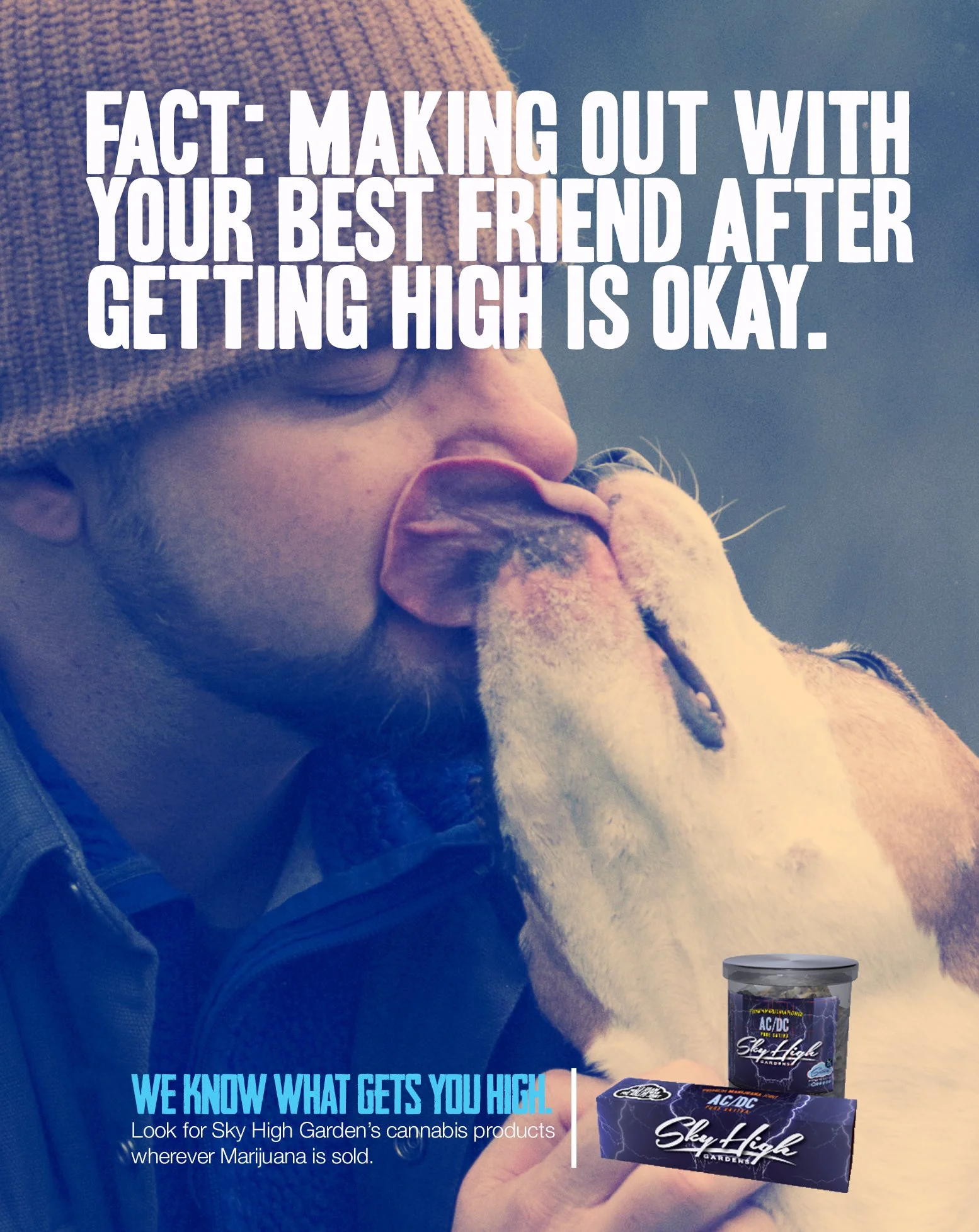
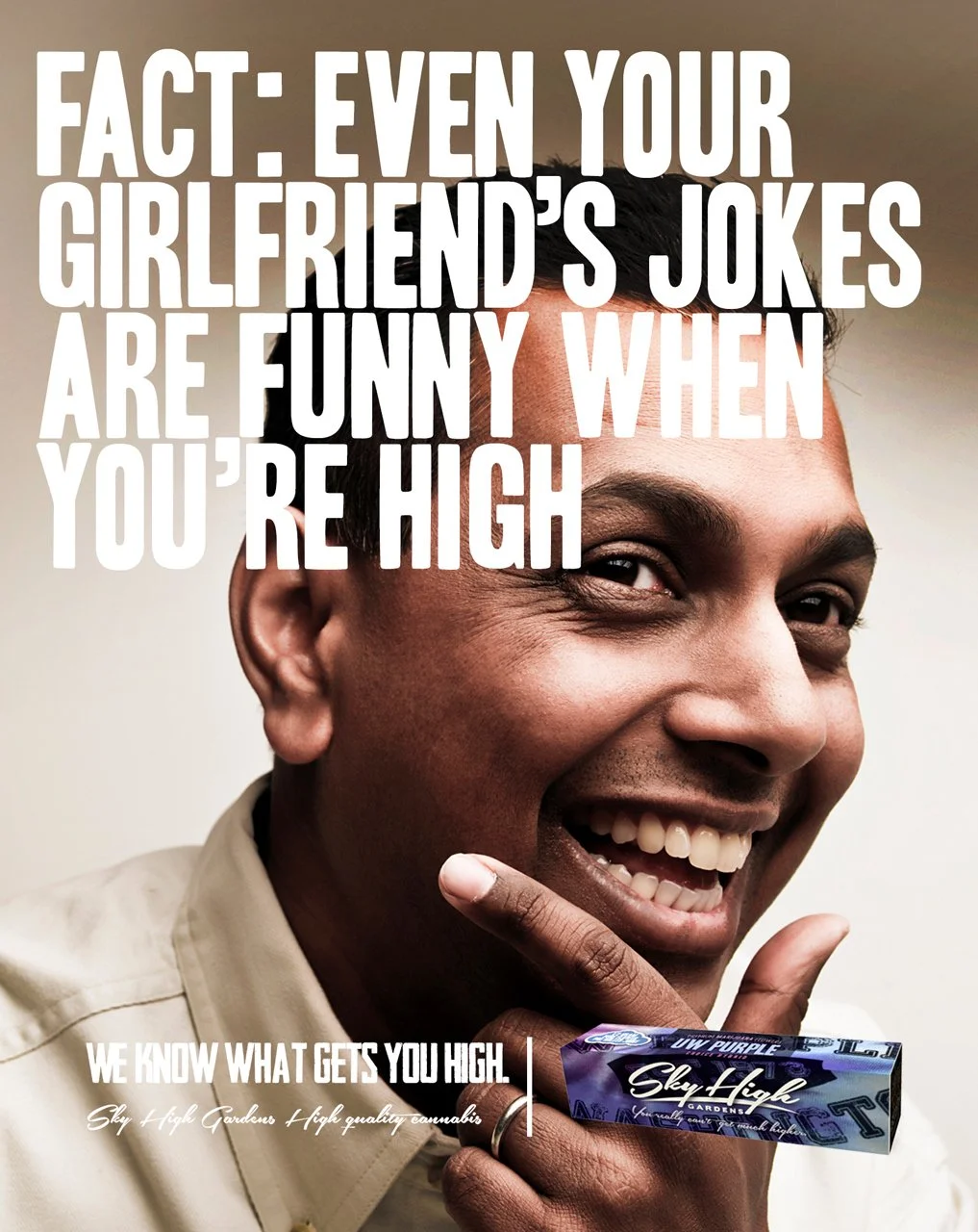
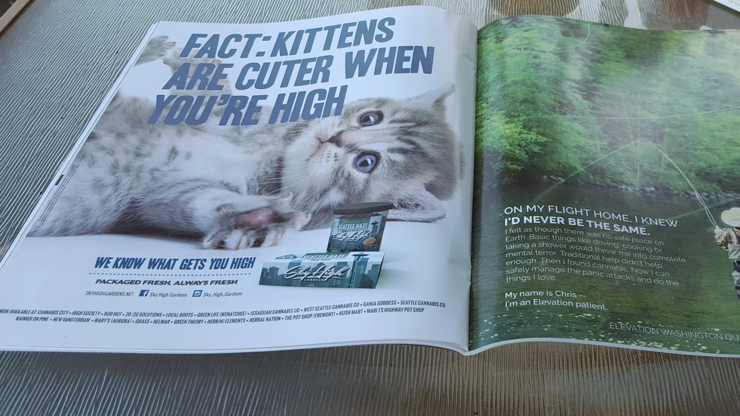
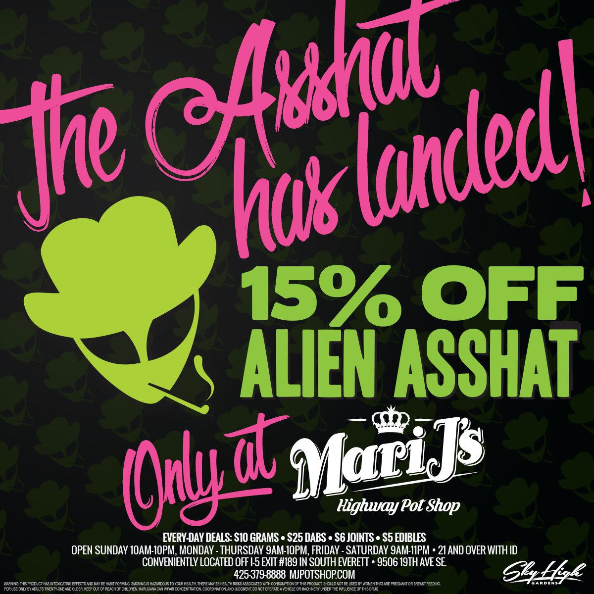
We built a campaign around a simple question: What do you like to do when you get high? Then we flipped the visual language of the category. While most ads looked like supermarket flyers or leaned on Bob Marley clichés, we went full image and zero product. Full page kittens. Full page clowns. Bold lines that people repeated. Kittens are cuter when you are high. Clowns are still scary when you’re high. It was playful, memorable and easy to share.
That creative choice did more than stand out. It felt premium, stayed within strict ad rules and opened doors others could not. We packaged a clean press kit and pitched the story. The work ran in The Seattle Times and landed on National Geographic programming. The approach made the brand easy to talk about and even easier to show.
“Gubi and Guttsen did more than give us a look. They gave us a language. They helped us see what Sky High could be, then built it piece by piece. They listened, collaborated with us, then built a brand that felt clean, confident and ours. Overnight our jars stopped blending in. Budtenders had a story. Customers started asking for us by name and coming back for the cards and posters they loved.
What impressed me most was how Gubi led. Calm under pressure, clear in his thinking and stubborn about the details that matter. He protected the product while making the brand bigger than the product. It felt premium without trying too hard and it traveled well into every shop we touched.
If you want someone who can turn a strong idea into a full world, hire Gubi. He made Sky High easy to spot and even easier to love.”
- Phil Seda, Owner, Sky High Gardens
The Process Overview
Pre
Audit the old mark and packaging. Visit shops. Talk with owners and budtenders. Map the shop’s layout. Define the look and the rules.
Make
Identity passes, strain art sprints, packaging tests, display mockups, merch samples and campaign lines.
Launch
Stage assets, book ad space, drop the strain posters, strain cards to customers, ship store kits and start press.
Highlights
A visual world that reads in two seconds
A strain art system that customers collected and shops displayed
Packaging that looks premium and prints clean
A campaign line people shared with each other
A sales kit that opened doors fast
Results
Launch month revenue at $55,464 then $159,583 one month later
End of year revenue at $1,192,836
End of year 2 revenue at $2,768,294
Faster pick ups and repeat visits tied to cards and posters
Broad retail placement across greater Seattle with strong budtender pull
Assets Delivered
Brand book, strain art library, packaging files, retail kit, merch pack, campaign copy blocks, press kit, sales deck.


What I Learned
Battle over shelf space is a sport. You win it with clarity and emotion
Give customers something to collect and they will come back
You can sell anything if you can explain it in one breath
Credits
Creative direction and brand by William Chiriboga & Micheal Guttsen. Along with their studio team, production partners and printers across Seattle. Client team at Sky High Gardens.
Want this energy for your brand?
There’s more to see.
-
![]()
SEEMS
A jazz record reimagined as a visual world.
Where sound, story and design play together. -
![]()
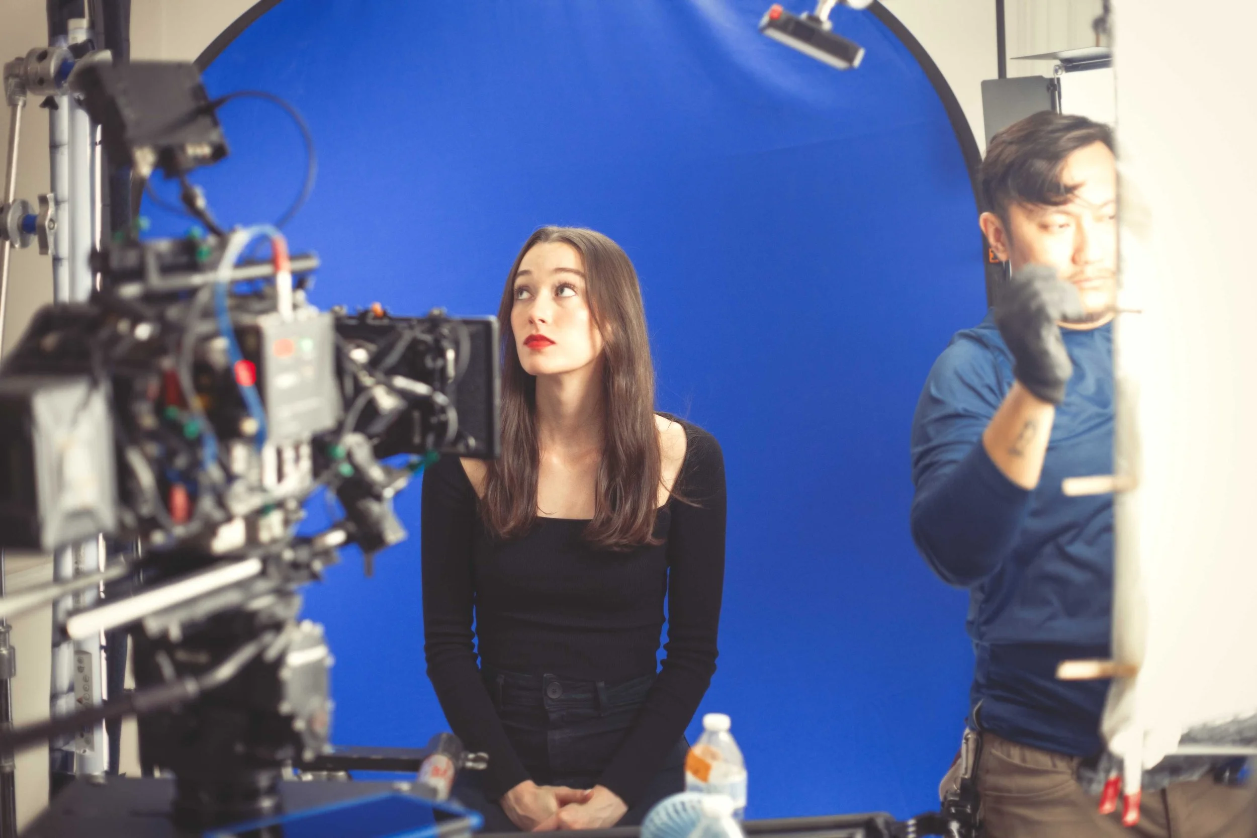
Film Production
I manage production from early planning to final delivery. I oversee budgets, schedules, crews and creative execution.
-
![]()
SIDES
A tight, controlled production where every detail served the story.
Produced with discipline from script to screen. -
![]()
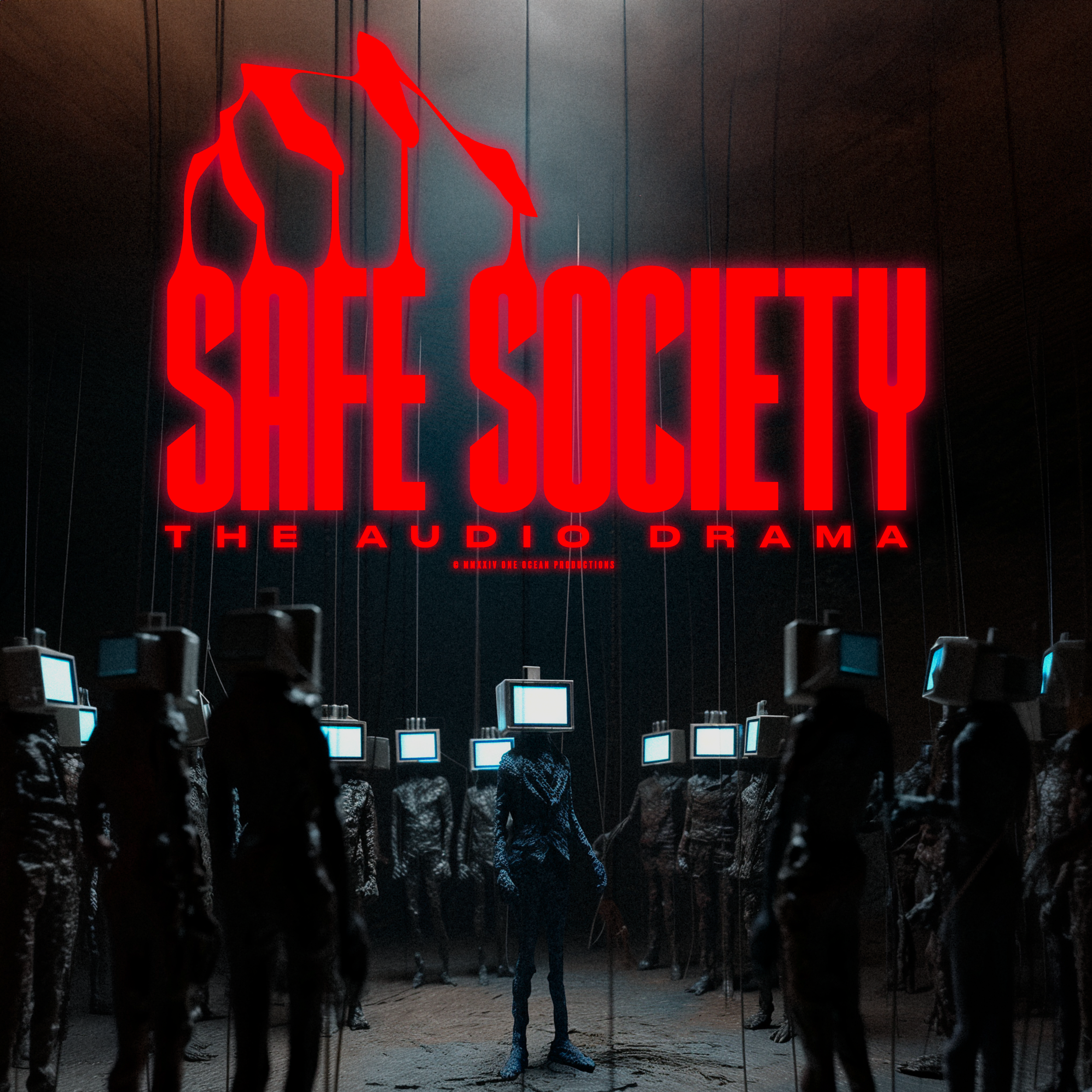
Safe Society
A film reimagined.
Proof that adaptability isn’t a backup plan, it’s the craft. -
![]()
Photography
Portraits, products, textures and places. I use the camera to give them presence.
-
![]()
Commercial
Sharp, effective visuals built to sell, persuade and perform.
-
![]()
Portraits
I capture people as they are or how they’ve always wanted to be seen.
-
![]()
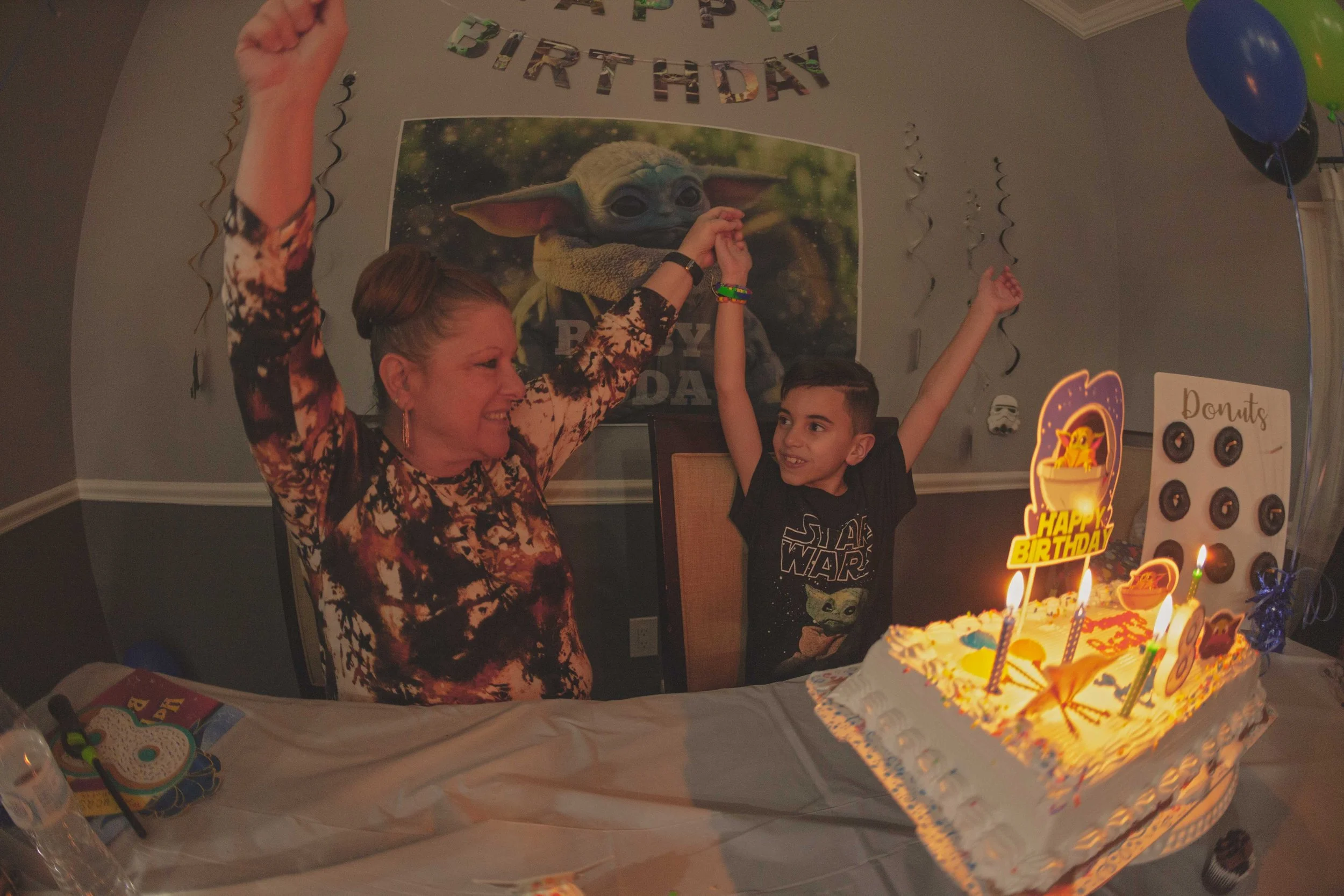
Celebrations
Document the moments that bring us together.
-
![]()
Personal
Shooting to explore. To express. To see what I haven’t seen yet.
-
![]()
Paintings
Color, gesture and control undone. Raw. Layered. This is abstraction.
-
![]()
Creative Direction
I shape the voice, visuals and structure behind brands, campaigns and the systems that support them.